CMR University

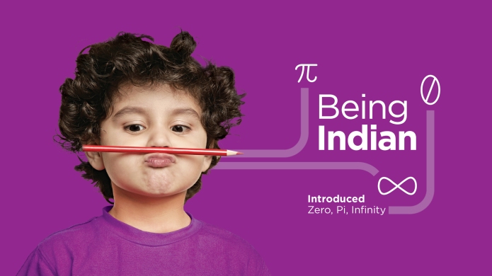
CMR University is a Creative University fostering an environment, a team and a curriculum that nurtures creativity. Creativity is the key competence required to navigate the complexity of our world and creative communities are where new ideas can be nurtured, new discoveries made and new creations shared with the world.IDIOM_blog_CMR1-01

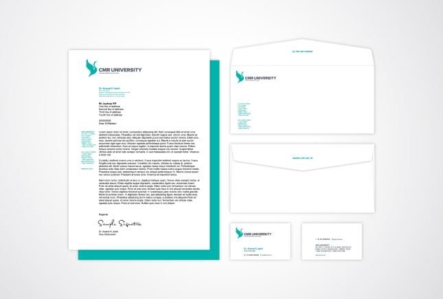
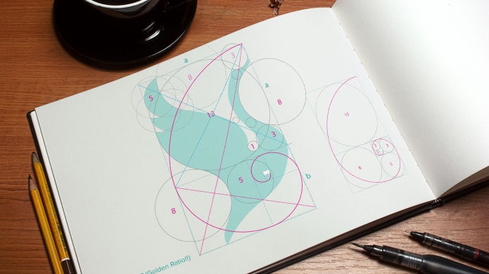
Idiom played a role in creating the new identity and brand experience for CMR University. The CMRU logo is the Hamsa, believed to be the King of birds and the seat of Saraswati, Goddess of wisdom and learning. The Hamsa is a form of positive knowledge, taking a bold flight of creativity and imagination. Crafted using the science and beauty of the golden ratio; the logo forms a strong and innovative identity for a New Age University.

IDIOM_blog_CMR1-08IDIOM_blog_CMR1-03

HIGH – The Ultra Lounge

Our most recent branding work developed for the Brigade Hospitality Group – HIGH, The Ultra Lounge, was launched on 5 feb, 2014.

Idiom was involved in the development of brand thought and positioning, the identity, the photography art direction, design of signage, interior graphics, menus, collaterals, products, merchandise and a series of films.

Continue reading

SCHOOL OF INDIA

Launch of SCHOOL OF INDIA!

International schools, smart schools, national schools, public schools, global schools, world schools, techno schools…different schools are shaping different kinds of India.  Yet there is a lack for  schools that celebrate “Indianness”.

For the first time in our country,  K.K. Education and Charitable Trust, with over a decade of schooling experience with Delhi Public School in Bangalore and Mysore, have launched the SCHOOL OF INDIA. A school where every student is proud of Being Indian.  A school where Nationalism is a grade higher than Internationalism!

With a picturesque campus in Bannerghatta Road, SCHOOL OF INDIA is now ready to create the next generation of Indian achievers!  Inspired by the country that has taught the world.

SOI

WATCH THE STORY BEHIND THE SCHOOL OF INDIA LOGO HERE!

Manipal Hospitals, Goa

Designing and developing experience for Manipal Hospital’s newest facility based in Goa

The brand imagery of the Manipal Hospital Goa is inspired from the connections of life and nature. The key design focus was translating the groups credo – LIFE’S ON – by using elements of nature like the fish, butterfly, turtle and dragonfly to represent optimism, happiness,longevity, sensitivity, inner strength, emotional maturity and change.Each department in the hospital focuses on preventive information that is presented simply, intelligently and graphically. Making healthcare, a truly positive affair.

“Goa hospital inauguration was a success. Feedback has been very positive. Ambiance is very happy and fresh due to the graphics.It was most appreciated and I’m looking forward to doing more constructive and aesthetic work with you going forward. All the best.”- Ms. Shruti Pai

“This is very good. I really like the panels for the In-patient and OPD doctor rooms. And the extension of the graphics with the flamingo, peacock and turtles will bring vibrancy to the interiors. Even the uniforms, very unlike typical hospital attire – very pleasing and, am sure, much more acceptable to patients. All these will certainly enhance patient experience. Thank you Idiom for the great work done.” – Mr. Rajen Padukone, MD & CEO, ManipalHospitals


Continue reading

NAWADCO brand launch

NAWADCO brand launch by Dr. Manmohan Singh, Honorable Prime Minister of India

Inauguration of the National Waqf Development Corporation Limited and unveiling of the NAWADCO identity by Dr. Manmohan Singh, Honorable Prime Minister of India, in New Delhi on Wednesday, 29-01-2014 at 10 am. Smt. Sonia Gandhi, Chairperson, UPA and National Advisory Council, was the Chief Guest at the function, presided by Shri. K. Rahman Khan, Minister of Minority Affairs.

A symbol born out of its vast heritage and represents the future of the National Waqf Development Corporation Ltd. NAWADCO is a new Central Public Sector Enterprise under the Ministry of Minority Affairs for the development of waqf properties for the benefit of the Muslim community. It will facilitate and mobilize financial resources for setting up of facilities like schools, colleges, hospitals on waqf properties for community purposes in a transparent manner.

NAWADCO Logo
NAWADCO LOGO STORY
Borrowing from Islamic architecture, its lineage and heritage, the logo is a symbol of the spirit of togetherness that makes NAWADCO a formidable philanthropic system that signifies progress for an entire community. Landmarks of Islamic architecture are distinct and memorable. They have simple geometric forms and connected infinite patterns, symbolizing purity and balance.